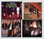
Final Video:
DigiPack:

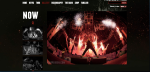
Website:
In what ways does your media product use, develop or challenge forms and conventions of real media product?
I created a promo package that consisted of a Music video, Digi-pack and website for a local band. My local band was a heavy metal band called ‘Warhead’. I researched existing rock bands and deconstructed how they use techniques to represent their iconography to help me find ideas for creating my own music video.
I looked at Ac/Dc’s music video ‘Highway To Hell’, Iron Maiden’s ‘Run to the hills’, The Foo Fighters ‘The Pretender’, Gaslight Anthem ’45’ and Avenged Sevenfold’s ‘Dear God’. I chose to deconstruct these videos as they are performance based videos, which was what I was aiming to create for my band Warhead. This links with Goodwin’s theory that music videos can either be narrative based, performance based or a mix of the both. Goodwin also says that there is a demand on close ups of the main artist which I found correct when researching these bands music videos. To enable me to create a promo package representing a similar rock genre for Warhead, I needed to understand the key conventions of the Rock genre.
I looked into four main areas and these were Camerawork, mise en scene, representation and iconography. I found that the typical camerawork would be close ups of the singer, crowd shots of the audience and shots of the instruments. This links to Archer’s theory of the ‘repeatability factor’, if you see them play often enough in the video the audience begin to believe they can actually play. The mise en scene of the rock genre consists of ‘bad boy’ costumes for example leather jackets and tattoos. The lighting is usually a back light to create shadows to make the artist look mysterious and dark. The iconography of rock bands are that they are rebellious and this is shown through their make up and costumes for example black colours that reinforce a scary connotation.
After gaining knowledge of the key conventions I researched into the typical audience and institution for a rock band. I found that the audience are mainly male dominated and the music video would most likely be seen on music channels such as ‘Scuzz’ or ‘Kerrang’. I looked into what type of record labels rock bands normally belong to. I found that Avenged Sevenfold belong to ‘Hopeless Records’ which is an independent label. This is expected with a rock genre band as ‘The big 3’ usually sign mainstream bands.
After completing my research on the Rock genre I was ready to plan the music video for Warhead. I began by creating an ANGRILI Model for the band. The ANGRILI Model consists of the 7 main areas to explore when analyzing and developing a music video. The audience, narrative, genre, representation, iconography, language and institution. I believed that:
The audience are: Rock fans who like dark clothing and tattoo’s etc.
The narrative would be: Live performance and voyeuristic style
The Genre is: heavy rock
The representation is: very energetic, lyrics are meaningful and sometimes quite dark
The iconography is: the way they are dressed so dark clothing, piercing’s and dark lighting to create shadows
The Language used is: fast cuts and close ups of instruments and main singer.
The Institution would be: rock music channels for example Kerrang and independent record labels for example Hopeless Records.
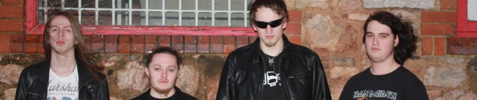
When creating the promo package for Warhead, I worked with Joanna Hendy. My proposal consisted of the plans for the music video and how it would be constructed. I decided to film the band practicing in their home and also live at a gig. I also said about including some cut away’s of the band relaxing and being themselves to create voyeuristic context. My proposal also says that when editing the music video I will use lots of effects and fast cuts to keep up with the pace of the song. This again links back to Goodwin’s theory of there being a relationship between the music and visuals, and how the editing needs to be in time with the music and camerawork. My proposal then goes through the shots that I originally planned for the storyboard; this included using the Go Pro camera to film some shots of the guitars, low angle shots of the band, long shots, audience shots and close ups. The proposal also planned the live gig filming as working around an audience was going to be very difficult. I also planned the props and costumes that I will be using for Warhead when filming the music video. For example leather jackets, dark colored clothes and casual jeans. The main props we used were their instruments for filming the performances and relaxing shots. Once we had told the band our plans and they’d agreed we filmed the footage for the music video and then used our editing skills to create a heavy rock music video for Warhead.
The music video we created follows the key conventions of the Rock genre as it is performance based. The music video also contains the repeatability factor of the band playing their instruments and close ups of the singer, this links to Steve Archer’s theory on performance based videos. The music video consists of fast cuts that match with the pace of the music. Due to the music video having many cuts we could use a lot of different camera techniques for each member of the band and could create a variety of different shots throughout the music video. For example low angles, side angles, go pro camera footage, long shots etc.
Throughout the music video we have included close ups of the singer to link back to the key conventions of a music video outlined by Goodwin. These shots allow the audience to believe that the band is performing live and creates verisimilitude. The lead singer of a band is the main face that fans and audiences recognize, so including close ups of them helps sell the band. During the music video the footage switches between the band rehearsing and live performance of the band at a gig which makes the music video more interesting to watch and promotes Warhead as a live gig band for their fans to go and see. When the pace of the music lessens, we decided to add in footage of the band relaxing with each other and playing different instruments to what they do in the band. Including this footage allows the band to promote to their fans that they are nice people that get along together.
When editing the music video we made some of the shots brighter and with more contrast as this made the colours stand out and made the room look less like a bedroom. On some of the clips we decided to use a colour filter and add different colours such as purple, red, blue and green. We chose these specific colours as these are the main colours which stand out in the live footage when at the gig and we wanted to keep the colour scheme throughout. We also added the earthquake effect to the footage where the band members are head banging to the music. We felt this would give the audience the feeling that they were joining in with the band. Between some of the clips we chose to add in transitions to make the change between clips a lot smoother. These techniques we gained from the various music videos that we watched, for example Machine Head’s Davidian showed us that using the effect of different colours creates chaos that matches the pace of the song. When filming the footage for the music video we decided to film using the camera portrait, we borrowed the idea from Queen’s music video ‘One Vision’. By having footage both landscape and portrait it allowed our music video to be unique and create a bit of difference from existing rock music videos. This links to John Stewart’s theory that a Music video is “incorporating, raiding and reconstructing” from other media.
Overall our music video matches the rock genre as it uses the camerawork and fast paced editing to allow the music video to match to the Rock music. However our music video does challenge the typical conventions of a rock genre music video as it uses portrait footage that is allowing more than one member of the band to be on screen with their instrument at the same time. Our music video allows the members of the band to be portrayed in their own field of their instrument but also as a band together in their landscape shots. Using this technique allows us to represent what Warhead are about as a band.
How effective is the combination of your main product and ancillary texts?
The promo package I created consists of a music video, digi- pack and website. The ancillary texts including the digi pack and website, work alongside the music video to help represent the iconography of Warhead which is being shown through the music video. The band’s iconography is that they are rebellious and like to be outrageous and express this through their music lyrics. In order to portray the representation of Warhead in the digi-pack we completed a photo shoot where we went to different locations and took images that looked professional.
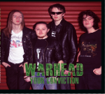
When researching digi-packs of the rock genre I found that there is a similar representation through the music videos and digi packs. I realised that the website and digi pack needed to follow the same theme to carry the similar representation. The research into Ac/DC’s digi pack showed me that it needed to consist of action shots of the members of the band with their instruments and performing live. This links back to our music video where we included live performance of the band. This digi pack also used lots of effects on the images which matches the rock genre theme throughout the music video of a variety of different effects. Me and my partner decided to use these features we had gained through research in our digi-pack. The front and back cover consists of a group image of the band in front of a garage and on some old stairs which reinforces the dark and rough like character that the band represents. We decided to use a font from the website ‘dafont.com’ which was called Master plan. This font was chosen because it is rough and has ‘war’ like connotations which matches the bands representation of being edgy. Throughout the music video green is an important colour; we decided to use this colour throughout the digi-pack design to keep it cohesive. On the back image there is a barcode and record label symbol that Warhead would likely be signed to as a band. The inside cover uses the same layout as our music video as it uses the portrait and landscape images as a split screen. This challenges the typical conventions of a rock genre digi-pack and allows for continuity throughout the music video and digi-pack. The disc space on the digi-pack has an image of the singer in a recording booth, this image was used as the singer is the main image for the band and also reinforces that they can actually sing and perform. We used a lighting effect on this image to make the picture have a shadow and focus on the singer. The digi-pack links to the representation of the band as they look dark and tough which reinforces the rock image.
The website used similar house styles of green and black. From research into existing websites such as Black Sabbath, AC/DC I found that black is a popular colour for the rock genre websites. The black colouring reinforces the dark iconography of the band and how they are mysterious and meaningful. We used the images we gained from the photo shoot for the digi-pack on the website so the audience feel like they know the band more. Richard Dyer states that “A Star is constructed from a range of materials”. This says that Warhead are promoted through all three products that we created for them. When researching websites I found that they all have similar pages including Galleries, Videos, about the artist/band and events. We then found an Artwork page which we thought would be a good idea for Warhead’s website as it allows us to show the audience our digi-pack designs. Similar to the Ac/dc website we included an image telling the fans about upcoming events on the home page so they did not have to search for it. The website is there to help promote the band to their fans and audiences where they can get involved. The website allows for active audiences to occur on web 2.0. Gauntlett states “interactivity on Web 2.0 makes users more creative”. This means that artists are starting to promote themselves with the internet for example ‘Youtube’ and their own websites.
Overall both ancillary texts match the conventions of the music video through house style, continuity and themes. The house style throughout the 3 products is green, black with the odd splash of colour for effect. Having the portrait footage and split screen in the music video is portrayed across to the digi-pack on the inside page where all the band members are seen together. This is also put across on the website where single images are used on various pages. Having the continuity allows for the products to link together and to keep the representation of the band the same so it does not confuse the audience. The theme of the rock genre is to have dark colours, serious faces and meaningful lyrics on their songs. This is shown through the images used and the house styles used throughout the three products.
The promo package as a whole is very suitable for Warhead as they are a rock genre band and the three products shows that very clearly and the representation is not confused in any way. All of the typical conventions of existing rock genre have been passed through onto Warhead’s products that we produced for them. The typical record label that the band would belong too would be an independent label as the type of songs that Warhead produce are not mainstream and do not apply to a variety of audiences. For example Hopeless Records are an independent record label who signs rock genre bands/artists which is suitable for Warhead as they are a rock genre band. The three products we produced are suitable for the audience that comes with the band as they use conventions that the typical audience enjoy. For example the rock music video contains live gigs which rock music is best known for enhancing the type of music it is. The digi-pack and website contains images of the band together and so gives the audience a sense of familiarity with the band as they believe they know the band personally. Overall the three products work well together to reinforce the rock representation of the band to the audience.
What have you learned from your audience feedback?
When planning the ideas for the promo package I had to consider the target audience for rock genre music and what the audience would expect from the band. During my research into the typical audience for heavy metal bands I found that the typical audience for Warhead are mainly male dominated and they were people who are interested in going to gigs and listening to live music. This is because the music of rock bands sounds a lot better live due to the instruments and atmosphere that comes with the band. Due to an up rise in technology the audience for Warhead would use web 2.0 to access the bands information for example social networking sites and YouTube etc.
When creating Warhead’s website I exploited web 2.0 by including links to social networking sites such as Twitter and Facebook to every page which encourages the audience to use them to promote Warhead. I also used web 2.0 when uploading the music video to YouTube. This allowed a greater range of viewers to help promote the band. The overall viewings on YouTube were 324, 143 of those views were through Facebook, 8 people liked the video and 1 person shared it. This shows that web 2.0 is helping to promote the band and get their music seen and heard by different people. 55 views of the music video were through a mobile phone device; this is again showing that technology in convergence devices is helping Warhead gain a bigger audience. 66 views were from referrals from other media A level students music videos. The way you tag a YouTube video is very important as it helps to link to the target audience you are expecting. We tagged our music video with words such as: Ac/DC, Avenged Sevenfold and Rock. These words all link to Warhead’s music video and so will attract similar audiences from other rock bands.
To gain more feedback from the target audience I held a screening of the music video, digi pack and website for 10 people who then filled out a questionnaire that I put together including different questions on the strengths, weaknesses and institution for Warhead from the products. The 10 people consisted of a mix of male and females and included some older and some younger participants. When answering question 3 “Do you think this music video looks like a rock genre music video and why?” 100% of the audience said it does look like a rock genre music video, 60% said because of the focus on the instruments, 20% due to the costumes, 50% said because of the fast pace editing and 20% because of the live footage. This shows us the main strengths to our music video and how we have used these features to obtain a stereotypical rock genre music video. The questionnaire also involved questions on all three products as a whole, when answering the last question “What improvements would you make to the music video, cd cover or website and why?” 50 % of the audience said change the font on the website, 30 % said change font colour on digi pack to something clearer to read, 10% said the colour scheme and 10% more live footage. However when the screening of the website took place there was some technical difficulties which resulted in the fonts and backgrounds to have changed. When asking them about the type of record label they would see Warhead on some of them got confused as they do not know specific labels, however 60% of people said independent labels, 10% said Roc Nation, 10% said Sony and only 20% said they weren’t sure. This shows that although they may not have known names of specific record labels the audience were still aware that the band would not have been signed to any of the major labels. One of the questions asks the audience “What music channels would you expect to see this music video on?” 70% said Kerrang, 30% said Scuzz, 20% said NME, 20% MTV and 10% were unsure. By obtaining these questionnaires and statistics on the three products has allowed us to be sure of what was good, bad and needed improving of the three products. It also allowed us to see if we had targeted the correct audience and how well the iconography of the band came across.
When Warhead watched their music video for the first time they were very pleased with the outcome. They were specifically pleased with the live footage and the variety of different shots especially the Go Pro camera of the guitars. They felt that the music video matched who they were as a band especially through the relaxing footage of them messing around during practice. The band liked the portrait footage and felt that it challenged the typical conventions, which they liked, as it was not stereotypical and gave the music video an edge. The band did say however that they would have enjoyed more outgoing effects but overall were really grateful that we contacted them to help promote them as a band.
Overall the feedback that I have gained for the three products match what I was expecting as the audience knew the type of genre, what TV channels it would be shown on and the representation of who the band are. I was surprised at how many views were collected by YouTube and also the social networking sites. However due to Web 2.0 and convergence devices this is typical for the target audience to obtain what they want from the Internet. It has shown me that technology plays a huge part in getting bands/artists noticed and it encourages their audiences to promote them using web 2.0 to create a bigger fan base.
How did you use new media technologies in the construction and research, planning and evaluation stages?
When producing my three products I used a variety of different aspects of technology to construct, plan and evaluate the music video, digi pack and website. At the start of the project I had to research and plan my ideas for the promo package. I used web 2.0 including YouTube when researching existing music videos to deconstruct the typical conventions of the rock genre. I also used web 2.0 when I had completed the music video and I wanted to promote Warhead’s video on YouTube and other social networking sites such as Facebook. By using web 2.0 it allowed me to be able to promote Warhead as a band. When filming the music video for Warhead I used HD camera’s, which allowed for prosumer technology and allowed the music video to be widely available. When editing the music video I used an editing software programme called ‘Final Cut Express’ which is again prosumer technology which enabled me to create a highly professional based music video for Warhead. By gaining feedback through YouTube and Facebook indicated that the audiences are active and obtaining information that they want when they want it. Some of the YouTube statistics showed that some of the viewings were through mobile devices showing convergence technology that is allowing for sharing of the music video and allowing it to become widely known.
When researching into existing rock genre bands to gain an idea of the iconography and representation needed to be portrayed in Warhead I used YouTube to deconstruct some music videos. By using an apple mac when researching these videos it allowed me to obtain screenshots of what I had found to back up my research and findings. Throughout the course we have used the website ‘Wordpress’ which is a website for blogging where we kept a log of all our research, planning, production and evaluation work for the promo package. Every time I researched a band’s music video I used screenshots to explain my findings where I could then look back when thinking of the representation of Warhead. When planning my ideas for the music video, website and digi pack I used a compact digital camera for the recce shots of the locations I was going to be filming to ensure I had the correct angles and lighting etc. When creating prop lists, shot lists and schedules I used the apple macs to create tables showing what time and where filming was going to take place, hat clothes we needed, and who was filming what so that we were organised. All of these things were put onto my blog onto ‘Wordpress’ where I could access them whenever I needed. Using web 2.0 allowed me to be able to access information I had found and planning I had done whenever I needed which enabled the process of filming the band to be quick and simple.
When producing the music video I used HD camera’s which enabled me to film footage with quality which made it look more professional. When editing the music video I used the programme Final Cut which allowed me to edit the clips very quickly and easy and also allowed me to add different effects throughout the music video to create a more rock genre video. When creating the digi-pack we carried out a photo shoot with the band to gain photographs we could use in the cd cover. To do this we used a HD Camera to enable us to gain high quality images. These images were then edited on a programme called ‘Photo Shop’ which allowed us to use different effects and lighting techniques to make the images look better and match the representation and iconography portrayed in the music video. We also used Photoshop for creating the digi-pack using an already existing template, which made it easy to see the front, back and inside panels. The website was created using a website called ‘wix.com’ which enables you to create a website free of charge. Using web 2.0 and this prosumer technology allows anyone to create a website showing that technology is so advanced that anybody can create things to help promote themselves as artists without the need for record labels. Creating the web page for Warhead allowed their band to be promoted and gain information for their fans.
When evaluating the three products I used YouTube and Social networking sites to gain feedback from the target audience. Putting the music video on YouTube allowed me to access where the viewing were coming from for example mobile devices, through Facebook or referrals. This made it easier to analyse the influence of web 2.0, convergence devices and social networking sites as these sites worked in synergy.
Overall when creating my three products I have used a range of technologies. Using horizontal integration in the three separate products has allowed Warhead to gain more active audiences and fans. Web 2.0 has allowed me to see that prosumer technologies are helping DIY artists promote and distribute themselves. Using the HD Camera, final cut and Photoshop has allowed me to inhance my skills and allowed me to be more creative with my three products. Warhead have been promoted through the music video, website and digi pack on web 2.0 and social networking sites creating a greater audience for the band through sharing and distributing the music video.
We started the website by splitting the pages between each other so I took the first four pages and Joanna took the last four. My pages were Home, About, Gallery and Events.
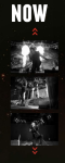
Homepage
I started with added in the pages onto the links at the top of the page. Once I had done this I decided to change the colour of text to white. When the mouse is hovered over the link to the next page the colour changes to green. I chose the colour green to match with the colour scheme we used for our Digi-pack design as this would keep the continuity. I then decided to add an image for the background on the homepage and this was a picture of the band standing in front of the garage that we took in our photo shoot for the Digi-pack. This image is spread across the page and all members can be seen. The next task was to include the band’s name. We both chose to put ‘Warhead’ in green as it stands out to the audience on the black background but to also match the house style we have used throughout our practical work. The font I chose was called ‘basic’ this was because this font was the only font that matched the representation of not being too ‘fancy’ and being classically simple. On the homepage we included links to Twitter and Facebook as these are popular social networking sites that will attract attention to the band. We both felt that we needed something more added to our homepage and so Joanna created an image in Photoshop telling the fans on the website about upcoming gigs. She used an image of the drums that we took at the photo shoot for the background and kept with the green theme for the text boxes. We then decided to add a button linking to the next page all about Warhead. This makes it easier for the fans to use the webpage.
About
The next page I did was the ‘About’ page where it tells the fans and audience a bit about the band. This included the names of the members of the band, their interests and where they are from. The text box that the text is written in we changed to a see through colour so that the image behind the text could still be seen. The text is written in the basic font and also in black as this colour is easily readable for the audience. I added some images to the side of the page to allow the audience to see who they are reading about. I chose ones where they are using their instruments to emphasis their skills in the band and to represent their rebellious and rock like look.
Events
The events page was made up of previous gigs that Warhead had done but also upcoming events. The text box was again see through so the image behind could still be seen. I chose the layout of having an image and text underneath to explain more about the gigs. I started with previous gigs that they had been too and added in images of the place or event they were taking place in for example Battle of the bands. I then added more recent events that have happened and that are going to happen. I wrote the events page from their point of view as they are talking to their fans. The text boxes were green again to keep in touch with the house style throughout and to allow it to stand out.
Gallery
For the gallery I chose the template where you can see some of the images and when you click on one it changes to a scroll where you can look through them all. When you hover the mouse over an image it changes to a dark green colour which again matches the colour scheme. The gallery allows you to see the band together with their instruments but also the images of the photo shoot we carried out for them, this makes the band look professional.
Joanna did the other four pages on the website which was Videos, Artwork, Forum and Contact.
Videos
On the video page we added our music video that we made for Warhead. As you click on the page the music video automatically starts, this is good because it will drag the audience in to watching the video and making comments.
Artwork
This page is for the band to upload images of their CD covers to show their fans. We started by uploading images of the front and back cover of the Digi-pack we made the band. Again the text is in green to allow for continuity throughout the website.
Forum
The forum page is where comments can be made about the bands music, gigs and videos can be made by the fans. The page starts with quotes from feedback already been given to Warhead. This is there to encourage people to comment on what they see. At the bottom of the page is a box where fans can email Warhead to leave their comments. There is another box where tickets can be bought for an event that the band will be taking part in, this is good because it encourages fans to go and watch Warhead perform and to give them support.
Contact
The final page on the website is where people can contact the band if they want to. This has the information of the band including social networking sites for people to talk to them. On this page is an image of the guitarist in the studio, this is giving the fans a relaxed and laid back approach to the band members allowing them to feel welcome to contact them.


We started our digi-pack by choosing which images we wanted to use of the band and which ones looked and reflected the band’s personality the best. Once decided this we then chose which panel each picture would look better on. We then started to edit these images. We started by editing the group image in front of the garage. This was our favourite image as the background fits in with the representation of the band being quite rural and dark. This image was editing using the red eye tool to first take away any red eye that occurred in the photograph and then the spot healing tool to make the band members faces look clearer. We chose to edit the brightness of the image to make it look darker again to match the representation of being dark and meaningful. We got the members to look straight into camera for the effect of direct address, so the audience feel connected to the band.
We then moved onto the inside left panel where we edited single picture of the band members and out them together. We thought this was a good idea as it shows the members singularly but also still matched together. These images were each cut up and red eye tool and clone stamp were used on them all. This section was hard to fit them all in together as they were all doing different poses and the panel is small and so we had to pick images we originally wouldn’t have picked so that they could all fit on. However once doing this we found that we preferred the panel in the outcome it was.
The disc panel was then created where we chose to have the singer singing into a microphone at a recording studio. We chose this image to go on the disc panel as the singer is the face for the band and represents the music that the audience will be getting in the cd. We chose to use a lightning effect on this image where you out a shadow on the rest of the image and only light on the part you want. I thought this was a good idea as it highlights the singer but also keeps in tone with the representation of being dark and mysterious which is shown by the shadow.
The back cover was then created where we chose another group band image of them standing on a staircase outside the recording studio. We really liked this idea as it bring them together again but also gives the feel of being rough and not caring about emotions. The image has got a slight sepia tone on it and this was to give it the older feel and to take away the brightness of the stairs and the lighting.
Once edited the writing then got put onto the cd cover. We got the font from a website called ‘dafont.com’ where we chose the font ‘Masterplan’. we chose this font as it had a distorted feel which makes it rough but also had connotations of war which is denoted in their name ‘Warhead’. WE chose to have the font green to carry on the colour scheme that the band had originally in their cd cover but also through the music video there is a lot of green. The back cover also used the same font and colour for the track listing, we decided to put this in the top right hand corner of the panel for it to stand out immediately and to fill the gap where their is image of the wall. The edge of the cd cover also has the same font and says Warhead Your Conviction on a black background. The ‘Your Conviction’ is written in white font and that is to make it stand out so the audience can see it straight away when wanting to buy it in the shop.
The back cover needs to be realistic and so we added on a barcode and a record label logo. We chose to use ‘Hopeless Records’ as the logo as it is a rock band record label. This makes the digi-pack look more realistic. Due to not wanting our images to get cut off we decided to make a black border around the outside of each image so we did not lose any features on our images.


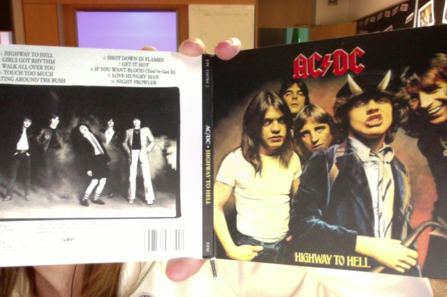
The front 2 pages of this digi-pack for the rock band AC/DC contains a group photo of the band members on the front. This photo has got a dark shadow around the edge to maintain the dark meaning of the band. The poses of the band members are quite serious but at the same time quite jokey which allows the audience to be told that they are a fun band. The name of the band is at the top of the page and in the centre, the colour is red with a yellow outline. This makes it stand out, and matches the connotations of the lightning bolt which is put in between the Ac and the DC. The font is very pointy and is made 3D by using reflection effects on each letter. At the bottom of the front cover is the name of the album which is put into the same font but a yellow colour which still matches the colour scheme of the cd cover. On the spine of the digi-pack it says the bands name in white on a black background and the name of the album in yellow again. The white on black font makes the name of the band stand out again and the yellow of the album name creates cohesion throughout the album front cover.
The back of the album cover has got a long shot of the band in a desolate area with smoke behind them. The main guitarist is pulling a screaming/laughing face which is making him stand out, he is the well known member of the band for their audience. The clothing of the band is representing the rock genre but there is also the school boy outfit which is his signature outfit. The singer of the band is dressed in flares and a blazer, this is unusual to the typical representation of rock music bands, but they were around in the 70’s/80’s where this fashion was popular. The photo is in black and white which gives the picture an enigma as to where they might be and also gives a dark meaning. The members of the band are all giving direct address to the camera which is attracting their audience. They have a track list at the top of the back page of the digi-pack. The track list is written in the same font as the album name on the front cover, this gives the album cover cohesion. The track list is black on white background which also makes it stand out and easy to read for the audience. The back of the cd cover also has the record label written above the barcode, this is reinforcing the bands label.
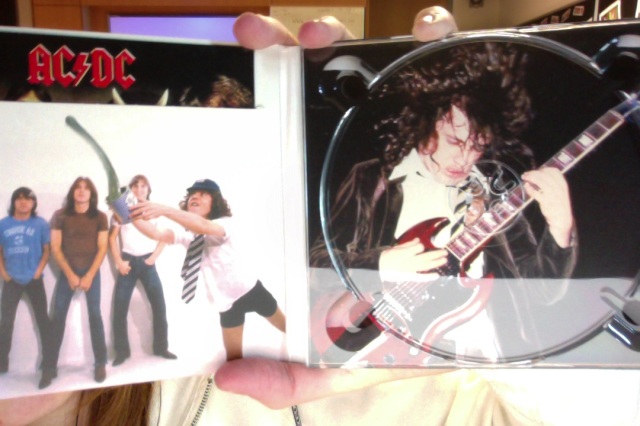
This is the inside of the cd album. As you can see on the left hand side is an image of the band together and the main guitarist is throwing paint out of a paint bucket. This is reinforcing that the band know how to have fun but is also emphasising the immaturity of Angus Young (the guitarist) which is known by the fans of the band. In this image the band are not dressed particularly rock like but with AC/DC they were always wearing jeans rather than the stereotypical leather jacket etc. This is due to the time they were around before rock was a big thing. There is a split in this section where inside is a small booklet of the bands lyrics to their songs. This booklet has the same front cover as this cd cover which allows for continuity of colour schemes.
The right hand side of this image is where the CD goes. Underneath this section is an image of Angus Young again playing the guitar with sweaty hair. This is emphasising his effort and devotion to playing well for his fans. Angus Young is the main focus of this band as he is a well known member of the band. Unlike most bands where the singer is the favourited and most recognised, with AC/DC it is the main guitarist which is why they have chosen to have him feature in every image on the Digi-pack.
Looking into this Digi-Pack instead of on the internet helped me see what I need to do for my own digi-pack for my band. This is a good Digi-pack as it emphasises the band as a whole and also reinforces the main member of the band as they are most recognised and so will help to sell the albums. It is emphasising the rock genre as the band are pulling faces and acting immaturely which is similar to most rock bands.
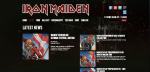
The third webpage I decided to look at was Iron Maiden as they are a heavy rock band that relates to Warhead and so the representation will link to each other which will help me create a good band page for my band.
The homepage for Iron Maiden’s webpage starts with a main image of the bands album cover and a sign to here their next gig is going to be held. It then scrolls across to another date and place where they are also gigging. This allows the fans to know straight away where they can next be seen.
The next page is the news of the band, this tells the fans where they are next performing. This is helpful for the fans as they can then buy tickets to go and see them performing. The ‘tour’ section has a list of the places in the year that the band will be performing at and also is there are tickets left to buy. This is again helpful as the fans can see if they can still buy tickets for certain events.
This website also has a gallery part where there are images of the band performing at different gigs. The images are in a scroll on the left where they remain black and white, however when they become the bigger picture on the right they come back into colour where the fans can see the detail more clearly.
There is a discography section on this website which was not on either of the other two webpages that I looked at. This is a section where the album covers to the bands albums are displayed so the fans can see them. When you click on the link it gives you the track listing of that album. This then has an ‘amazon’ link to where the fans can buy the album.
The section called ‘the band’ contains information about the band and how well they did in 2012. This is keeping the fans up to date with how well the band are doing and their progresses. The shop section redirects you to the official website of where the fans can buy merchandise with the band’s logo and name on to wear to gigs etc. This helps them promote their band and gain recognition.
There is also a fan club section where there are images of the fans at gigs which scrolls along at the top of the page through all the images. Overall this band page is good as it represents the rock genre through the colours chosen, the iconography for example the skull head coming up across the links at the top of the page, this helps reinforce the dark side of the rock genre. This band page also has links to social networking sites which remains very popular with younger audiences, it also creates new fan bases as people share music etc and the band gets recognised. This webpage represents rock genre very well.


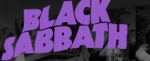
I researched into Black Sabbath’s website to see the layouts and colours used to match the rock genre which is similar to Warhead. The homepage for the band’s website has images of the band and these images move to show the different links to each page eg gallery, videos and events. It also has a link to a ‘new album’ which is good as it gives the fans something to look into straight away. The page moves right when the cursor is hovering over the right of the page. This reveals more of the links that could not be seen before eg ‘News’.
The background of the home page is full of black and white images of the band posing and also performing. The name of the band ‘black sabbath’ is written in purple on the top left of the page, this gives the page a bit of colour and emphasises that the band are dark but also fun.
There is a ‘news’ page where it tell the fans the ticket sales of the live events occurring during the calender months and allows the audience to read articles which have been written about the event where the band performed. The events section tells the fans about upcoming tour dates and where the band will be performing.
There is also a video section where the band have uploaded videos of themselves performing and their music videos. There is also a video of a press conference with the band that the fans might be interested in seeing.
There is also a link to an official store site for the band’s merchandise where the fans can buy t shirts etc. This link is good for the band as it helps sell things to help them get money and also to promote the band.
Overall this webpage is good for the rock genre as it has a black and white colour scheme which allows for the dark side of the band to be portrayed. The purple of the ‘black sabbath’ creates emphasis to the band and allows the audience to know straight away if they are on the right site. This page allows for easy use and gives the correct information to the fans.